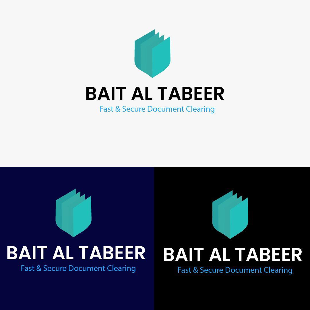
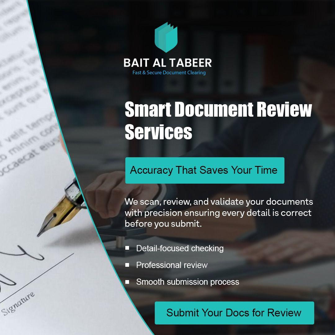
🛡️ Brand Identity Design: Bait Al Tabeer This project features a comprehensive logo identity system designed for Bait Al Tabeer, a professional service provider specializing in “Fast & Secure Document Clearing.” Key Design Elements & Analysis: Iconography & Symbolism: The primary mark is a minimalist, geometric icon. The layered shapes suggest stacked folders or documents, […]
🛡️ Brand Identity Design: Bait Al Tabeer
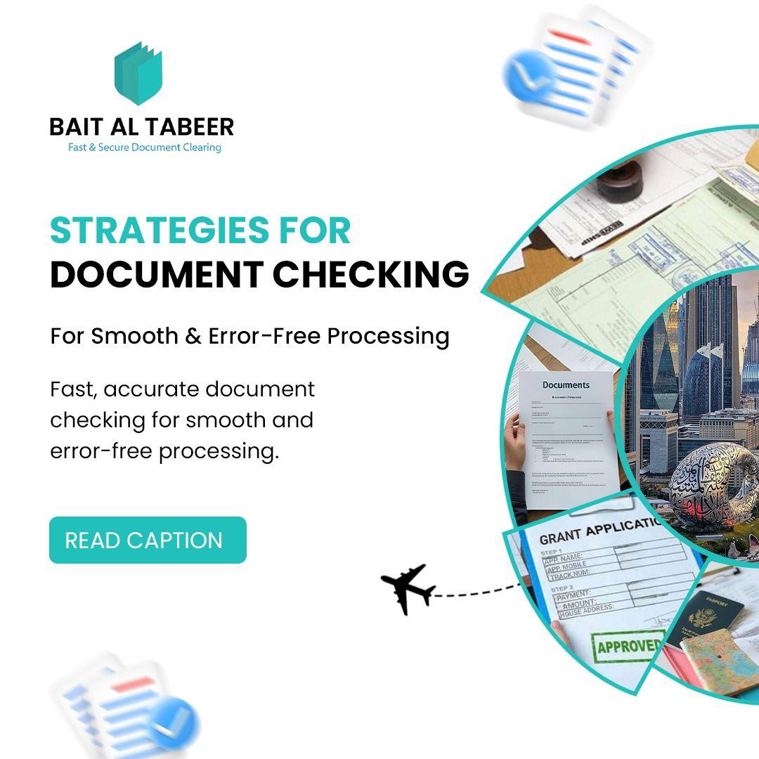
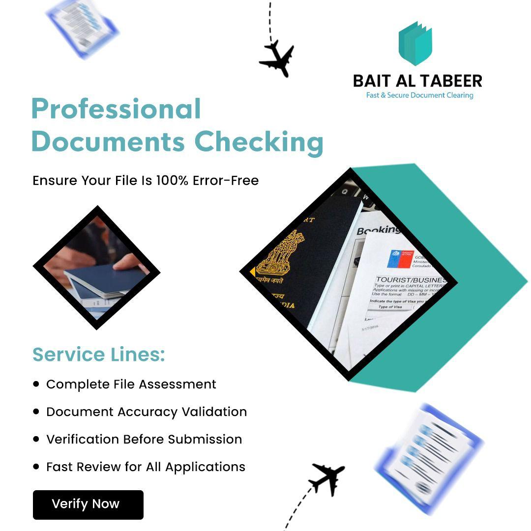
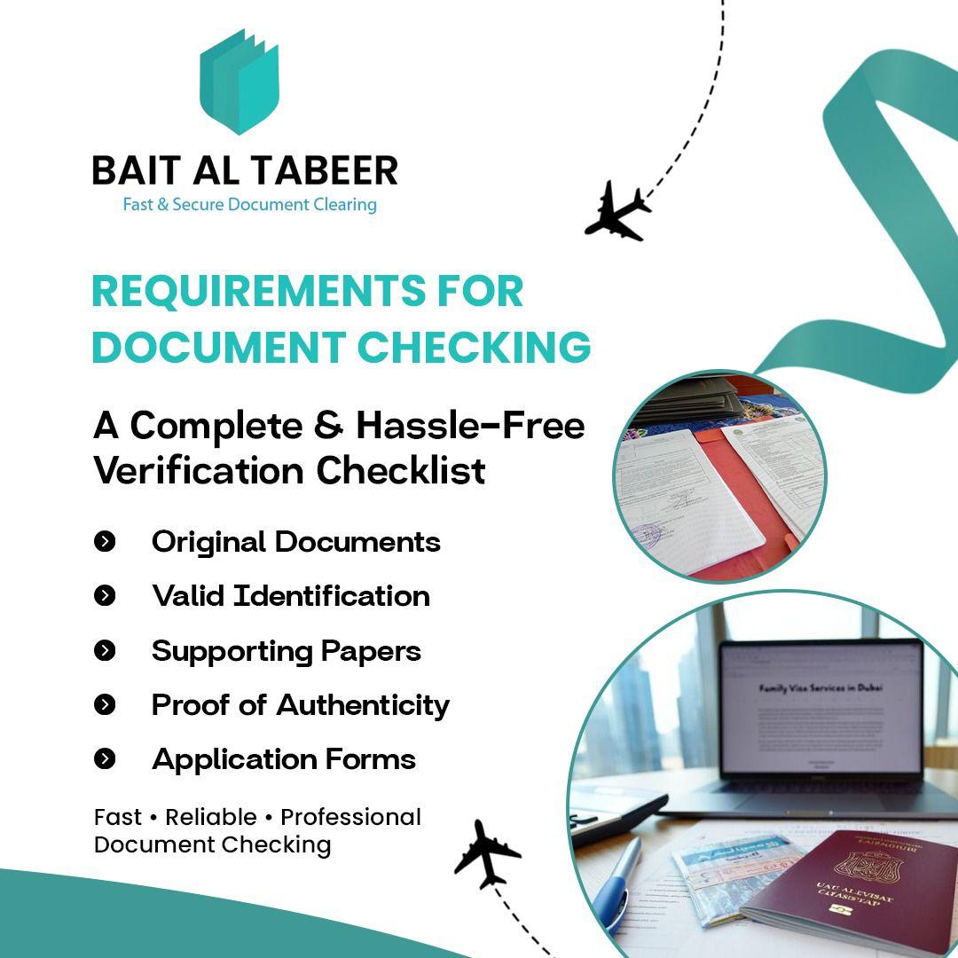
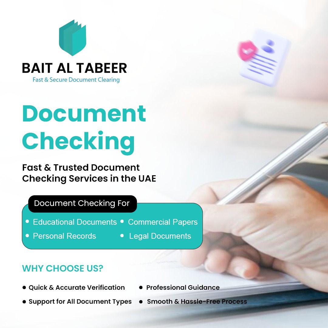
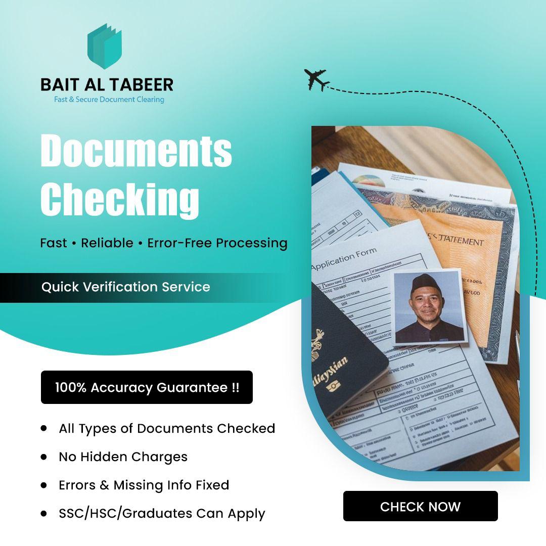
This project features a comprehensive logo identity system designed for Bait Al Tabeer, a professional service provider specializing in “Fast & Secure Document Clearing.”
Key Design Elements & Analysis:
Iconography & Symbolism: The primary mark is a minimalist, geometric icon. The layered shapes suggest stacked folders or documents, while the overall structure forms a shield-like silhouette. This perfectly reinforces the brand’s core values of organization and security.
Typography: * Brand Name: The main text, “BAIT AL TABEER,” utilizes a bold, modern sans-serif typeface in all caps, conveying authority, reliability, and corporate professionalism.
Tagline: The tagline, “Fast & Secure Document Clearing,” is set in a lighter weight and smaller scale to create a clear visual hierarchy, ensuring the brand name remains the focal point.
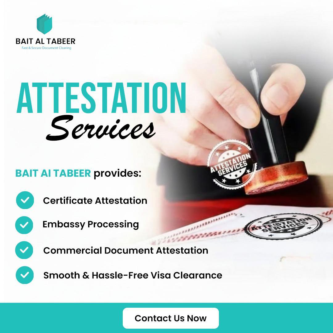
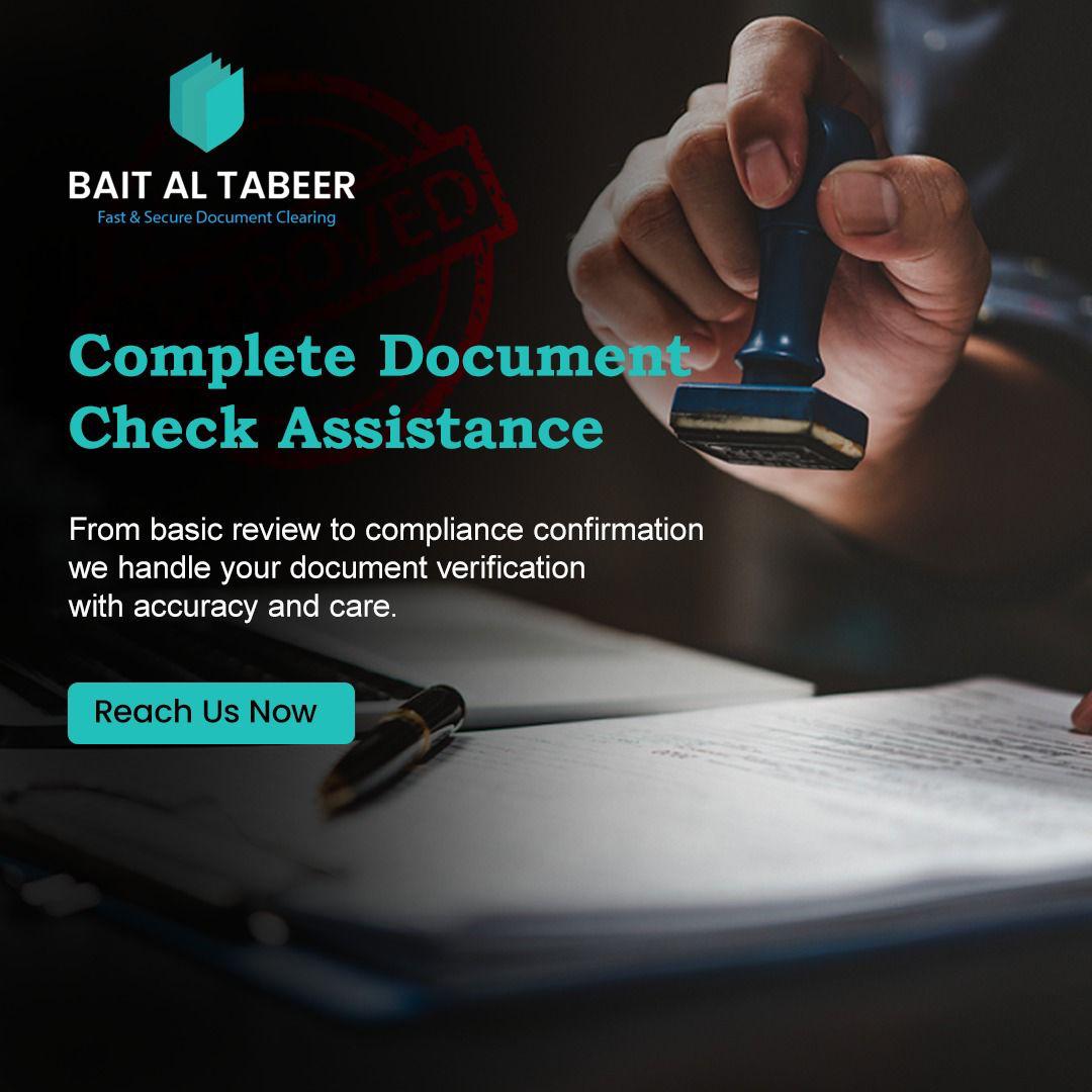
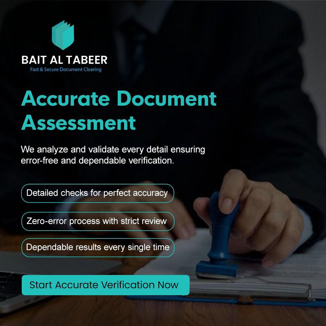
Color Palette: The primary brand color is a vibrant teal, which represents efficiency and freshness. This is paired with dark navy and black backgrounds to evoke a sense of trust, stability, and high-end service.
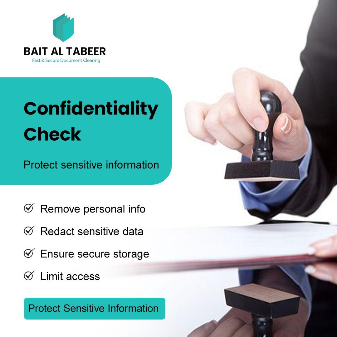
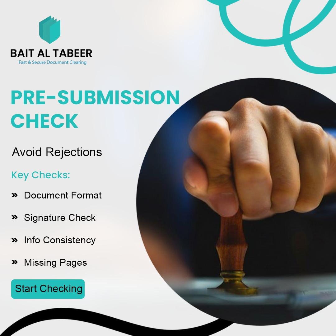
Versatility & Adaptability: The portfolio sheet demonstrates the logo’s effectiveness across multiple backgrounds (white, navy, and black). This highlights the logo’s flexibility for various applications, from letterheads and business cards to digital platforms and dark-mode interfaces.
Portfolio Description (Summary):
A professional brand identity designed for Bait Al Tabeer, a document clearing service. The logo combines a geometric, shield-like icon representing security with clean, bold typography to establish a trustworthy corporate presence. The design exploration focuses on high-contrast versatility, ensuring the mark remains impactful across both light and dark professional mediums.